📊 Multivariate Visualization — Scatter Plot, Multiple Scatter, Bubble Chart, Density Chart
Goal: Provide PhD-level theory, math, hand-computable numerical examples.
- Scatter plot (bivariate)
- Scatter multiple (grouped scatter + scatter matrix)
- Bubble chart
- Density chart (2D KDE, contour, hexbin)
1) Scatter Plot (Bivariate)
1.1 Theory
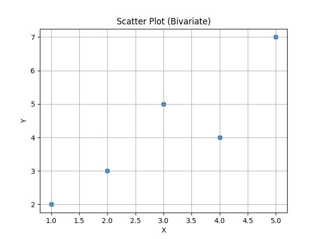
A scatter plot shows paired observations \(((x_i, y_i) )\) as points in \((\mathbb{R}^2 )\). It reveals association, trend, clusters, and outliers.
Pearson correlation (strength of linear association): \(r=\frac{\sum_{i=1}^n (x_i-\bar x)(y_i-\bar y)}{\sqrt{\sum_{i=1}^n (x_i-\bar x)^2}\sqrt{\sum_{i=1}^n (y_i-\bar y)^2}}.\)
1.2 Hand Numerical Example
Data (n=5):
\((x=[1,2,3,4,5])\), \((y=[2,3,5,4,7])\).
\((\bar x=3)\), \((\bar y=4.2)\).
Compute sums:
\((\sum(x_i-\bar x)(y_i-\bar y)\) \(\qquad\qquad\qquad = (−2)(−2.2)+(−1)(−1.2)+(0)(0.8)+(1)(−0.2)+(2)(2.8)\) \(\qquad \qquad \qquad = 4.4+1.2+0−0.2+5.6=11.0)\)
\((\sum(x_i-\bar x)^2= 4+1+0+1+4=10)\) \((\sum(y_i-\bar y)^2= 4.84+1.44+0.64+0.04+7.84=14.8)\).
\((r=11/\sqrt{10\cdot 14.8}=11/\sqrt{148}=11/12.165=0.904)\) (~).
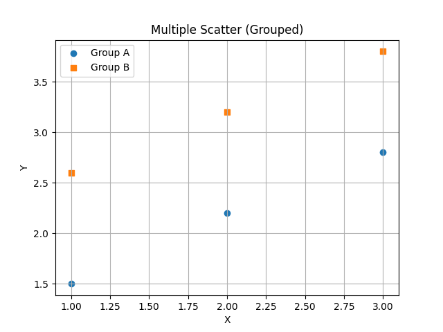
2) Scatter Multiple
Two common meanings:
1) Grouped scatter (category-wise coloring/markers) to compare clusters/groups.
2) Scatter matrix to view pairwise relationships across many variables.
2.1 Theory (Grouped Scatter)
Given groups \((g\in\{1,\dots,G\})\), plot \(((x_i, y_i))\) with style/color by \((g_i)\). This reveals between-group separation and within-group variance.
2.2 Hand Numerical Example (Grouped)
Data with group labels:
- Group A: \(((1,1.5),(2,2.2),(3,2.8))\)
- Group B: \(((1,2.6),(2,3.2),(3,3.8))\)
Visual expectation: B sits above A (larger \((y)\) for same \((x)\)).
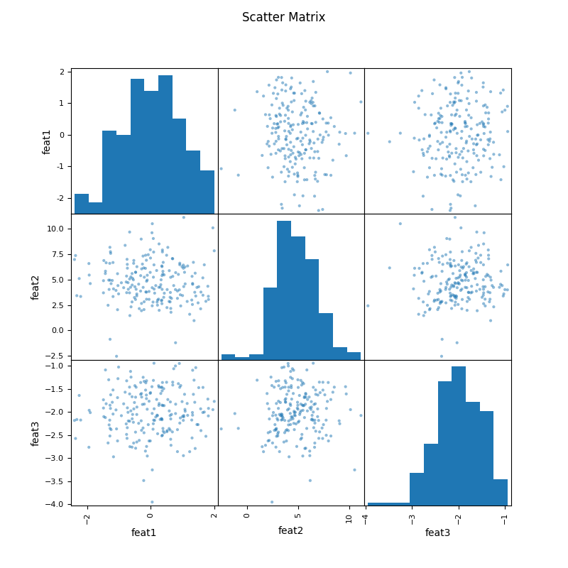
2.4 Scatter Matrix (Pairwise Scatter for \((p)\) variables)
Idea: For a dataset \((X \in \mathbb{R}^{n\times p})\), visualize all \(\binom{p}{2}\) pairs to assess linear/nonlinear relationships.
Correlation matrix: \((R = [r_{jk}]_{p\times p})\), where \((r_{jk})\) is Pearson correlation between \((X_{\cdot j}\) and \((X_{\cdot k})\).
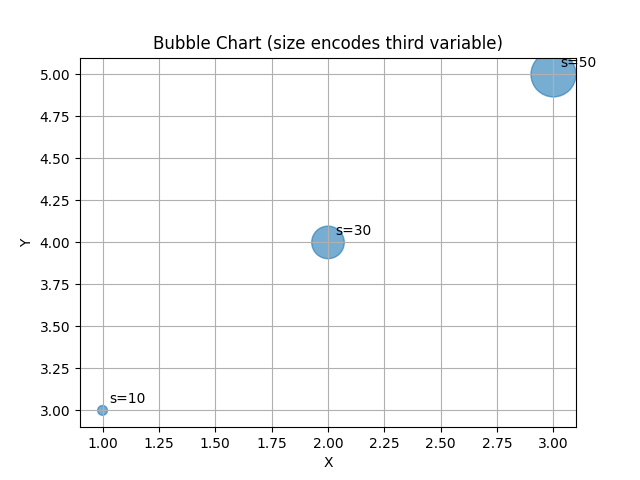
3) Bubble Chart
3.1 Theory
A bubble chart extends scatter by mapping a third (and possibly fourth) variable to marker size (and color). For triplets \((x_i,y_i,s_i)\), bubble area is proportional to \((s_i)\) (not radius), i.e. marker size \((\propto s_i)\).
Common scaling: If \((s_i)\) are raw magnitudes, use size in points\((^2)\):
to avoid vanishing/huge bubbles.
3.2 Hand Numerical Example
Data: \(((x,y,s))\)
\(((1,3,10), (2,4,30), (3,5,50))\). Let \((\alpha=1000)\), \((\beta=50)\), \((\epsilon=0)\).
\((\min s=10, \max s=50)\).
Normalized sizes:
- for \((10)\): \((50)\) (smallest)
- for \((30)\): \((50 + 1000\cdot (20/40)=50+500=550)\)
- for \((50)\): \((50 + 1000\cdot (40/40)=1050)\)
4) Density Chart (2D Density: KDE, Contour, Hexbin)
4.1 Theory: 2D Kernel Density Estimation (Gaussian)
Given points \((\{ \mathbf{x}_i \}_{i=1}^n \subset \mathbb{R}^2)\), \((\mathbf{x}=(x,y))\), diagonal bandwidth \((H=\mathrm{diag}(h_x^2, h_y^2))\). The 2D Gaussian KDE is$
\(\hat f(\mathbf{x})=\frac{1}{n\,2\pi h_x h_y}\sum_{i=1}^n \exp\!\left(-\tfrac{1}{2}\left[\left(\frac{x-x_{i}}{h_x}\right)^2+\left(\frac{y-y_{i}}{h_y}\right)^2\right]\right).\)
Contours of \((\hat f(\mathbf{x}))\) yield
density/contour plots; discretization via counts yields hexbin.
4.2 Hand Numerical Example (Evaluate KDE at one location)
Data \((n=3)\): \(((0,0), (1,0), (0,1))\).
Let \((h_x=h_y=1)\).
Evaluate at \(((x,y)=(0,0))\).
Offsets and exponent terms:
- From \(((0,0))\): exponent \((= -\tfrac{1}{2}(0^2+0^2)=0)\) → \((\exp(0)=1)\)
- From \(((1,0))\): exponent \((= -\tfrac{1}{2}((−1)^2+0^2)=-0.5)\) → \((e^{-0.5}=0.60653)\)
- From \(((0,1))\): exponent \((= -\tfrac{1}{2}(0^2+(−1)^2)=-0.5)\) → \((0.60653)\)
Sum \((=1+0.60653+0.60653=2.21306)\).
\(\hat f(0,0)=\frac{1}{n\,2\pi h_x h_y}\sum \exp(\cdot)=\frac{2.21306}{3\cdot 2\pi\cdot 1\cdot 1}=\frac{2.21306}{18.8496}=\mathbf{0.1175}\;(\text{approx}).\)
5) Practical Guidance (Exam Tips)
- Scaling for bubble charts: map area (not radius) to the magnitude.
- Overplotting: use transparency (
alpha), smaller markers, or hexbin/density. - Correlation vs. Causation: high \((r )\) does not imply causality.
- Bandwidth choice (2D KDE): start with \((h_x,h_y )\) near the sample SDs times \((n^{-1/6} )\) (2D analogue); adjust by visual diagnostics.
- Scatter matrix: inspect both diagonal (univariate distributions) and off-diagonal (pairwise scatter).
6) References
- Tukey (1977), Exploratory Data Analysis.
- Cleveland (1993), Visualizing Data.
- Scott (2015), Multivariate Density Estimation.
- Matplotlib documentation (Pairwise scatter & hexbin).