📊 Graphic Displays of Basic Statistical Descriptions of Data
🎯 Objective
To understand and visualize basic statistical descriptions of data using graphical methods such as:
- Quantile Plot
- Quantile-Quantile (Q-Q) Plot
- Histogram
- Quartile Plot (Box Plot)
- Distribution Chart (Density Plot / KDE)
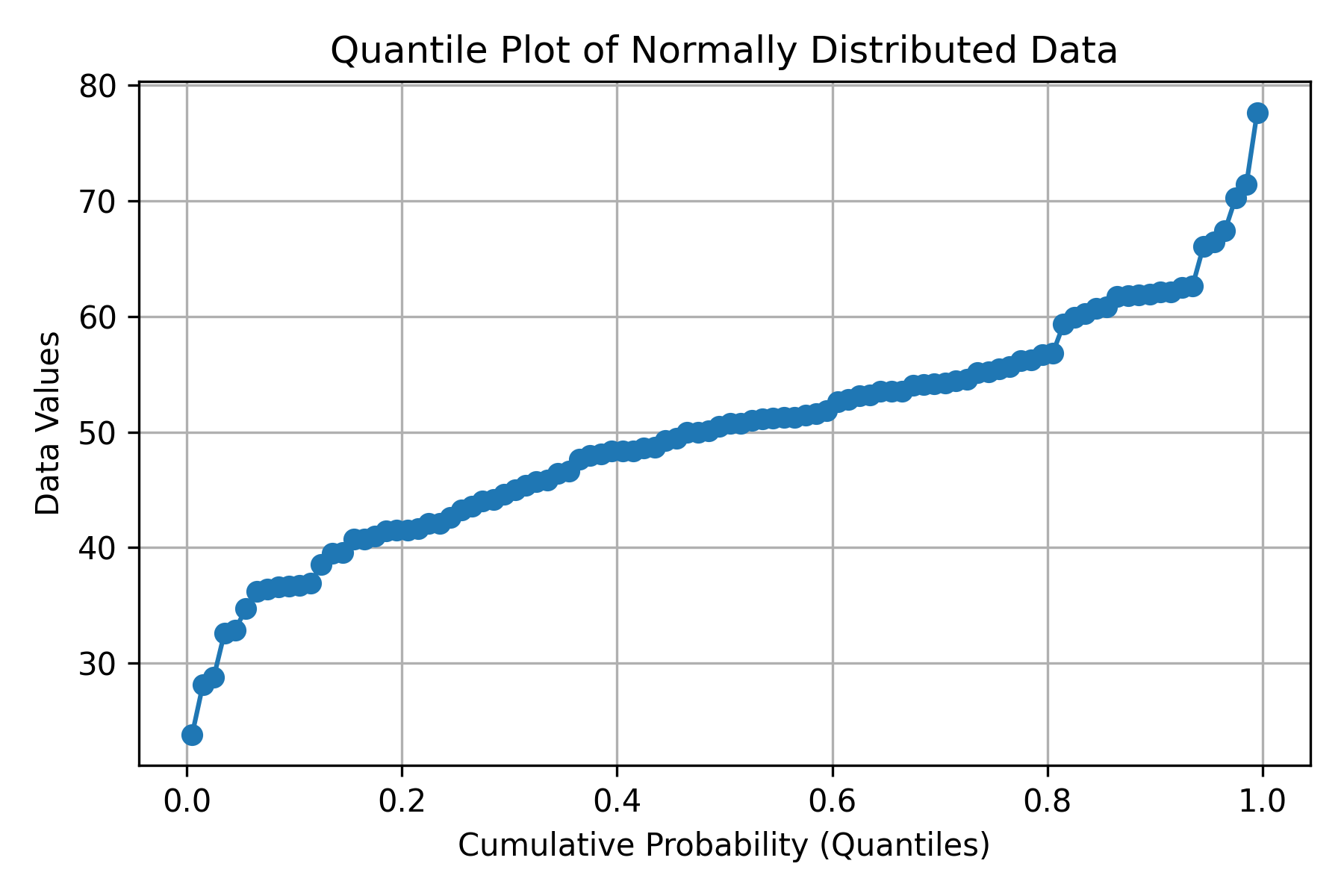
Quantile Plot
✳️ Definition
A quantile plot displays the ordered data against their cumulative probabilities.
It helps visualize how data values are distributed and whether they deviate from a uniform or theoretical distribution.
📐 Formula
For ordered data values \( x_{(1)} \le x_{(2)} \le ... \le x_{(n)} \) :
Each data point is plotted as \(( (p_i, x_{(i)}) )\).
🧮 Manual Example
Given data: [10, 12, 15, 18, 20]
| i | x(i) | p = (i-0.5)/n |
|---|---|---|
| 1 | 10 | 0.1 |
| 2 | 12 | 0.3 |
| 3 | 15 | 0.5 |
| 4 | 18 | 0.7 |
| 5 | 20 | 0.9 |
Plot these \( (p, x) \) points to get the quantile plot.
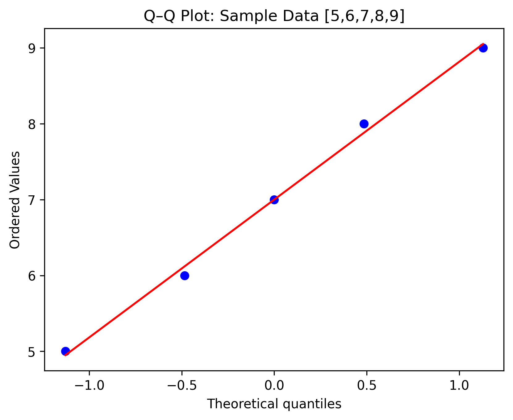
Quantile–Quantile (Q–Q) Plot
✳️ Definition
A Q–Q plot compares the quantiles of the sample data with those of a theoretical distribution (usually normal).
🧮 Manual Example
Given sample data: [5, 6, 7, 8, 9] (n=5)
Step 1: Compute ordered z-values (theoretical quantiles for normal distribution).
For i = 1 to n:
\([ p_i = \frac{i - 0.5}{n} ]\)
| i | Data \( x_i \) | \( p_i \) | \( z(p_i) \) from Z-table |
|---|---|---|---|
| 1 | 5 | 0.1 | -1.28 |
| 2 | 6 | 0.3 | -0.52 |
| 3 | 7 | 0.5 | 0.00 |
| 4 | 8 | 0.7 | 0.52 |
| 5 | 9 | 0.9 | 1.28 |
Plot \( (z, x) \). If points form a straight line, data ~ Normal.
🧩 References
- Tukey, J. W. (1977). Exploratory Data Analysis. Addison-Wesley.
- Cleveland, W. S. (1993). Visualizing Data. Hobart Press.
- Seaborn Documentation: https://seaborn.pydata.org
- Matplotlib Documentation: https://matplotlib.org